v.Latest
Documentation
String Fields
Loading last updated info...
On This Page
A text input field used to store short-form content, such as titles or descriptions.
For indents, embolding and other formatting, use the rich-text field type instead.
Type Definition
For additional properties common to all Field types, check the Field type definition.
REQUIRED
type
string
Set this to "string" to use the String Field.
REQUIRED
name
string
The name of the field for internal use.
All properties marked as REQUIRED must be specified for the field to work properly.
Examples
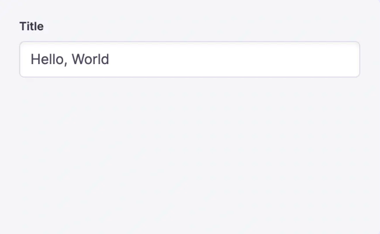
Simple field
{type: 'string',name: 'title',label: 'Title'}

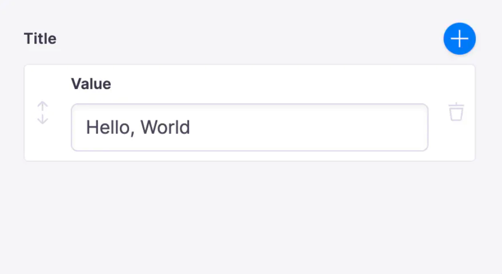
Simple list field
Setting list: true will make the value an array
{type: 'string',name: 'title',label: 'Title',list: true}

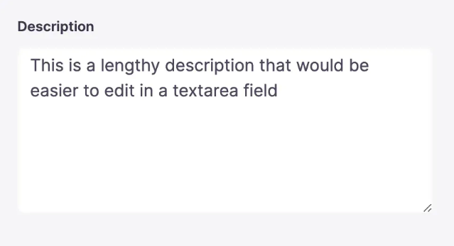
Field with text area component
By default, the text field is used for strings. To use a different core field plugin, specify it with the ui.component property.
{label: "Description",name: "description",type: "string",ui: {component: "textarea"}}

Field with custom component
You can create your own components for the TinaCMS editor to store String type content.
{label: "Title",name: "title",type: "string",ui: {component: ({ input }) => {return (<div><label htmlFor="title">Title: </label><input {...input}></input></div>);},},}
