Fields
Fields define the content structure, and the form fields that appear in the editor for a particular collection.
These are categorised as Field Types – which determine what data is stored and which input component appears in the editor.
Options for field types include:
rich-text(markdown)
The basic type definition is outlined below. Some field types extend the below type definition with type-specific options.
Type Definition
The name of the field.
Determines the data type and form field used.
The collection name as shown in the editor. Uses name if omitted.
A short description about the field that will be displayed to the user.
If true, disables save while this field has no value.
Controls the name used for the field in content files.
Defines the field title.
String fields only.
Defines which field is saved to the Markdown body.
Text (rich-text and string) fields only.
Restrict allowed values to the given options.
Scalar fields only.
All properties marked as REQUIRED must be specified for the field to work properly.
Name
The name of the field to be used in the GraphQL schema.
Should be unique amongst sibling fields.
This name cannot have spaces, dashes, or special characters.
The nameOverride property can be set to be used to replace the field name in your content files. The actual name property will still be used in other cases.
fields: [{name: 'my_field',nameOverride: 'my-field',//...},];
Field title
isTitle controls which field will be shown for the file in the collections page. If never set, filename will be used.
To use this property...
- Keep it as a top-level field (it is defined in
collections.fieldsorcollections.templates.fields). - Set
requiredto true on the same field. - Only include on one field per collection.
Field (markdown) body
Typically content saved in markdown files will be stored in the front-matter section.
isBody controls what field to link to the body section instead.
To use this property...
- The field should be of type
rich-textorstring. - The collection should be
"mdx"or"md"format. - Only include on one field per collection.
List Fields
Specifying list: true creates an array of the associated field.
- Reference Field Types cannot be set as a list. To work around this, they can be wrapped in an object field type that has been been marked with
list: true. - Only the following types have dedicated list UIs built into the CMS...
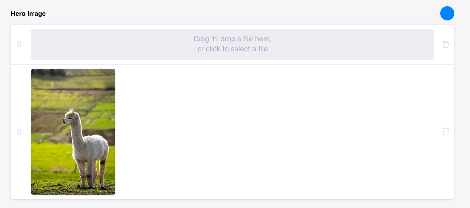
fields: [{label: 'Hero Image',name: 'heroImage',type: 'image',list: true,},];
ui.max
Setting ui.max on lists of object field types disables the add button in the editor, once at least the given number of elements have been added.
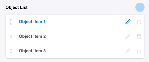
This is not supported for objects using Templates.
{type: "object",label: "Object List",name: "objectList",list: true,ui: {max: 3,},// ...}
ui.min
For any list field, if ui.min is set, the delete button is greyed out (see below) while there are less than the minimum items.
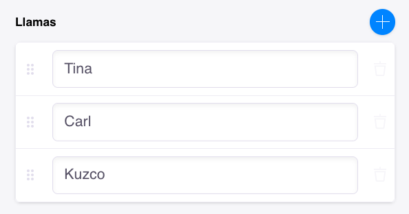
{type: "string",label: "Llamas",name: "llamas",list: true,ui: {min: 3,}}
Select Fields
Any scalar field can accept an options array to restrict allowed values. This changes the editor component to either a dropdown or set of checkboxes.
You can either pass in an array of values, or an array of objects of structure:
Option Property | Definition |
|---|---|
value | The actual value associated with the option. |
label | The name of this option as shown in the editor. |
Checkbox fields
Create a set of checkbox fields by using both options and list properties:
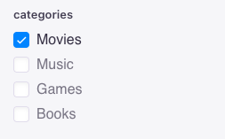
fields: [{name: 'categories',type: 'string',list: true,options: [{value: 'movies',label: 'Movies',},{value: 'music',label: 'Music',},//...],},];
Dropdown field
Create a dropdown field by using options but not the list property:
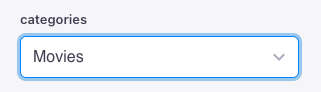
fields: [{name: 'categories',type: 'string',options: [{value: 'movies',label: 'Movies',},{value: 'music',label: 'Music',},//...],},];
Formatting Field Values
The format and parse defines functions that control what is rendered and what is being saved.
In the below example, as the user types they will see all lowercase characters. When it is saved, it will be all uppercase characters.
// ...fields{name: "username",type: "string",label: "Username",ui: {// is called on every form change but result is stored in data and not in the form value (saved to file but not displayed to the user)parse: (val?: string)=>val && val.toUpperCase(),// Is called on every form change and the result is put back into the value of the form (displayed to the user)format: (val?: string)=> (val ? val.toLowerCase() : ""),},},
Validating Field Values
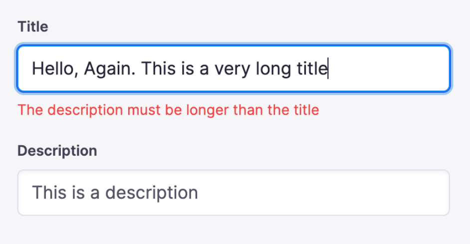
Tina allows client-side validation using a validation function, ui.validate. This function returns a string error message if the value is invalid or null if the field is valid.
To include other field values of the form in the validation, an allValues argument can be used.
Not compatible with reference, object and rich-text field types – they have a more complex internal structure.
{label: "Title",name: "title",type: "string",ui: {validate: (value, allValues) => {const titleLength = value?.length || 0const descLength = allValues?.description?.length || 0if (titleLength >= descLength) {return 'The description must be longer than the title'}}}}