Rich-Text Fields
The rich-text field stores markdown content with a WYSIWYG interface, supporting features like text formatting, links, media and custom elements (if used with mdx).
Type Definition
For additional properties common to all Field types, check the Field type definition.
Set this to "rich-text" to use the Rich-Text Field.
The name of the field for internal use.
MDX support. The "embed" option in the editor to inject custom React components.
All properties marked as REQUIRED must be specified for the field to work properly.
Thetemplatesproperty is formdxsupport.
"children"should not be used as thenamefor rich-text fields, as it conflicts with other parts of the application.
markis a reserved component name used internally for the highlight feature. If you create a custom MDX component named mark, it will conflict with the highlight functionality and cause unexpected behavior in the editor.
property controls a series of overrides and customisations to the rich-text editor.
Select which toolbar options are displayed. The following options are supported: ['heading', 'link', 'image', 'quote', 'ul', 'ol', 'bold', 'italic', 'code', 'codeBlock', 'mermaid', 'table', 'raw', 'embed'].
Whether the rich-text Floating Toolbar is enabled or disabled.
Restricts which heading levels are offered in the editor UI. Accepts any subset of ['h1', 'h2', 'h3', 'h4', 'h5', 'h6']. When omitted, all levels are available.
Line Breaks
To insert a visible line break in TinaCMS Rich Text (for example, inside a quote), press **Shift + Enter **(soft return) where you want the break.
After saving, check the Markdown. A preserved line break shows up as a standalone \ line:
> Quote text…> \> Author name
This behavior is not part of the standard Markdown specification but is specific to TinaCMS Rich Text implementation.
Tables
Check out this video on how to use Table in rich text editor:
Multi-line cells are not supported because content is serialized as Markdown. Tables only support single-line rows and cells. Use lists or separate fields if you need to represent multiple lines of content.
Column Alignment
The visual editor does not currently support setting column alignment through the toolbar. If you need to align content in a table column, you can do so by switching to Raw Markdown mode and editing the alignment syntax in the table header separator row.
Example — centering the second and third columns:
| Alignment | Separator | Example || :--- | :---: | ---: || Left | `:---` | Left || Center | `:---:` | Center || Right | `---:` | Right |
To learn more about the alignment syntax, refer to the Markdown Extended Syntax
Highlight
Customize highlight colors
You can enable text highlighting in a rich-text field and define which highlight colors are available to editors by adding a highlightColors array to the field’s overrides.
export const heroBlockSchema = {fields: [{label: "Text",name: "text",type: "rich-text",overrides: {highlightColors: [{ label: "Purple", value: "rgba(142, 132, 255, 0.55)" },{ label: "Blue", value: "rgba(132, 255, 255, 0.55)" }],},},],}
Examples
Tina will generate the appropriate component depending on the configuration provided.
Simple field
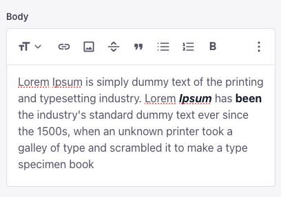
{label: "Body",name: "body",isBody: true,type: "rich-text",}
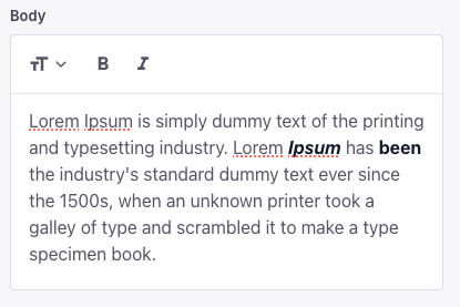
Simple field with toolbar override
Change what you want to display and the order it is displayed in the editor
{type: "rich-text",name: "body",label: "Body",isBody: true,overrides: {toolbar: ["heading", "bold", "italic"],showFloatingToolbar: false,},}
Limit the available heading levels
Use headingLevels to control which headings editors can choose. Pass any subset of ['h1', 'h2', 'h3', 'h4', 'h5', 'h6'], in any order — the value is applied to the headings dropdown, the "Turn into" menu, the slash menu, and the markdown autoformat shortcuts (for example, typing ## for an h2). When omitted, all six levels are available.
{type: 'rich-text',label: 'Excerpt',name: 'excerpt',overrides: {toolbar: ['heading', 'bold', 'italic', 'link'],headingLevels: ['h2'],},}
headingLevelswas released in tinacms@3.8.4. Update your packages to use it.
This option is UI-only — it limits what editors can insert going forward. Existing content that already uses a disallowed level is still rendered as-is. Passing an empty array (headingLevels: []) removes every heading level from the editor.
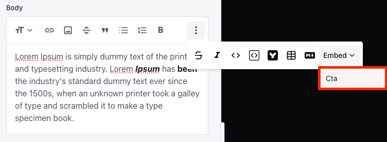
Field with custom component (mdx)
Custom components can be embedded in rich-text blocks.
{label: "Body",name: "body",isBody: true,type: "rich-text",templates: [{name: "Cta",label: "Cta",fields: [{name: "heading",label: "Heading",type: "string"}]}]}
This is some text<Cta heading="Welcome" />
{"data": {"post": {"body": {"type": "root",{"type": "p","children": [{"type": "text","text": "This is some text"}]},{"type": "mdxJsxFlowElement","name": "Cta","props": {"heading": "Welcome"}}]}}}}
Collection with default rich-text value
To set a default value for a rich-text field, the entire AST tree should be specified as in the example below.
Recommended approach is to fill in your data, thenconsole.logthe CMS API return value for the related field.
Then copy it from there into the collectionsdefaultItemproperty.
{label: 'Blog Posts',name: 'post',path: 'content/posts',defaultItem: () => {return {title: 'My New Post',body: {type: 'root',children: [{type: 'p',children: [{type: 'text',text: 'Default Text',},],},],},}},fields: [{type: 'string',label: 'Title',name: 'title',},{type: 'string',label: 'Post Body',name: 'body',isBody: true,},],}