React Components
A custom component can be passed and rendered by setting the ui.component property on a field.
This component completely overrides the original component, providing the user with the ability to fully customize the field.
Environment Variables in Custom Components
Custom field components run inside the Tina admin, which is built as a static SPA separately from your site. Environment variables are embedded into the admin JavaScript at build time — they are not read at runtime. This means two things must be true for a variable to be available:
- It must use an allowed prefix. For security reasons, only these variables are included:
TINA_PUBLIC_*NEXT_PUBLIC_*NODE_ENVHEAD
- It must be set when
tinacms build(ortinacms dev) runs. If the variable isn't in the environment during the build, it won't exist in the admin regardless of its name.
Any other environment variables (e.g. process.env.MY_SECRET_KEY) will be undefined in custom components.
// This works — correct prefix AND set during buildconst apiKey = process.env.TINA_PUBLIC_MY_API_KEY// This will be undefined — no allowed prefixconst secret = process.env.MY_API_KEY
If your custom component relies on an environment variable and it's always
undefined, check that: (1) the variable name starts withTINA_PUBLIC_orNEXT_PUBLIC_, and (2) the variable is defined in your.envfile or CI environment whentinacms buildruns. Note that Tina only loads.envfiles — not.env.localor.env.development. See the config reference and security advisory for details.
The ui.component Property
This should be set to a valid React component that accepts up to four props:
field: The field definition for the current field.input: The data and callbacks necessary to make an input.meta: Metadata about the field in the form. (e.g.dirty,valid).form: The CMS form, use to retrieve and update other fields from the same collection.
Preserving Metadata
To keep the same label, description, validation and other meta settings on your custom component, you can make use of the wrapper function wrapFieldsWithMeta.
Form management
The form prop can be used to control form values in other fields.
Any field in the collection can be updated with form.change – form.change(name: string, value: any) => void, using the fields name property.
Any field in the collection can be accessed using form.getFieldState(name: string)?.value, using the fields name property.
Further usage patterns can be inferred from the react-final-form FormAPI docs.
Hidden fields
Setting component.ui to the value "hidden" removes the field from the editor.
The field still exists behind the scenes and can be accessed in other ways.
Examples
Slider component
Here is a custom slider component that can be used for adjusting image saturation.
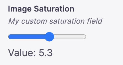
{label: "Image Saturation",name: "saturation",type: "number",description: "My custom saturation field",ui: {parse: (val) => Number(val),component: wrapFieldsWithMeta(({ field, input, meta }) => {return (<div><inputname="saturation"id="saturation"type="range"min="0"max="10"step=".1"// Passes props.input.onChange{...input}/><br />Value: {input.value}</div>)})}}
Image component with hidden meta-fields
NextJS and other frameworks are able to improve performance if image widths and heights are known ahead of time.
TinaCMS can be used to determine and store this on upload.
We can pass along the existing TinaCMS Image component, and intercept changes to it with a useEffect that updates our width and height fields.
import { ImageField } from 'tinacms';const CustomImageField = (props) => {const loadImage = async (url) => {const img = new Image();img.src = url;await img.decode();return img;};const { form, input } = props;useEffect(() => {loadImage(input.value).then((img) => {form.change("imgWidth", img.naturalWidth);form.change("imgHeight", img.naturalHeight);});}, [form, input]);return ImageField(props);};
In the content model we also need two additional fields for height and width, which are set to "hidden" so they don't appear in the editor.
{type: 'image',label: 'Hero image',name: 'imgSrc',ui: {component: CustomImageField,},},{type: "number",name: "imgWidth",ui: {component: "hidden",},},{type: "number",name: "imgHeight",ui: {component: "hidden",},}
This shows up as a singular Image input in the editor, but 3 values will be saved on each update (image source, height and width).
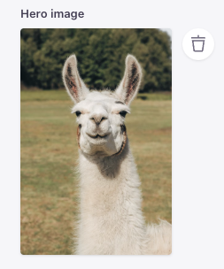
imgSrc: /uploads/llama - 2.avifimgWidth: 987imgHeight: 1480
Conditional component
Conditional fields can be created by checking values of other form fields.
With this approach, a hidden conditional field will hold whatever value was saved to it before it was hidden.

{type: "boolean",name: "imageEnabled",label: "Image Enabled",},{type: 'image',label: 'Hero image',name: 'imgSrc',ui: {component: (props) => {const { form } = props;return form.getFieldState("imageEnabled")?.value ?ImageField(props) : null;},},},
Icon-picker component (video)
The below tutorial includes a segment on creating a custom Icon selector using a custom field component.
Image scale slider component
With a little bit of extra CSS you can create scalable images in Tina. This will save you having to crop images for your blog.

import { wrapFieldsWithMeta } from 'tinacms';// inside your collection{label: "Image Scale",name: "scale",type: "number",description: "My custom image scaler",ui: {parse: (val) => Number(val),component: wrapFieldsWithMeta(({ field, input, meta }) => {return (<div><inputtype="range"min="1"max="200"step="1"{...input}/><br />Value: {input.value}</div>)})}}
import client from "@/tina/client";import { useTina } from "tinacms/dist/react";// Your componentconst Image = (props)=>{const response = useTina({query: props.query,variables: props.variables,data: props.data});return <div style={{width: '500px',height: '500px',position: 'relative',}}><imgsrc="/llama.png"style={{position: 'absolute',objectFit: 'contain',scale: response.data.scale / 100,}} /></div>}
Building Custom Components with AI
In the video below, a vibe coding approach to building custom components is explored. This demonstrates how to quickly iterate on complex UI logic and styling to create personalized field experiences through the use of AI.
Video: Vibe Coding TinaCMS Custom Components (7 min)