Toggle Field
This is an advanced-use feature, and likely not something you'll need to configure. What you probably want is the content types reference!
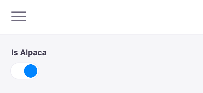
The toggle field represents a true/false toggle. This field is typically used for boolean content values. You could use this to toggle a certain feature on the page on or off.
Options
interface ToggleConfig extends FieldConfig {component: 'toggle'name: stringlabel?: stringdescription?: stringtoggleLabels?: boolean | { true: string; false: string }}
Option | Description |
|---|---|
| The name of the plugin component. Always |
| The path to some value in the data being edited. |
| A human readable label for the field. Defaults to the |
| Description that expands on the purpose of the field or prompts a specific action. (Optional) |
| Customize 'labels' next to the true / false states of the toggle. When |
This interfaces only shows the keys unique to the date field. Visit the Field Config docs for a complete list of options.
Example: Published Flag
Below is an example of how a toggle field could be used to mark a blog post as published.
const BlogPostForm = {fields: [{name: 'published',component: 'toggle',label: 'Published',description: 'Check to mark this to publish the post.',toggleLabels: {true: 'On',false: 'Off',},},// ...],}