Blocks Field
This content is out-dated for the latest versions of TinaCMS. See other docs pages for more up to date information about Blocks
This is an advanced-use feature, and likely not something you'll need to configure. What you probably want is the content types reference!
The Blocks field represents a list of items, similar to the Group List field, but allows each entity in the list to have a unique shape.
For an in-depth explanation of the Blocks field, read our "What are Blocks?" blog post. To see a real-world example of Blocks in use, check out the Tina Grande Starter.
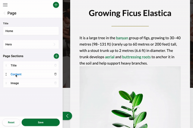
In the gif above, you see a list of Blocks: Title, Image, and Content. The form for this field could be configured like this:
const PageForm = {label: 'Page',fields: [{label: 'Page Sections',name: 'rawJson.blocks',component: 'blocks',templates: {'title-block': TitleBlock,'image-block': ImageBlock,'content-block': ContentBlock,},},],}
/*** Block template definition for the content block**/export const ContentBlock = {label: 'Content',key: 'content-block',defaultItem: {content: '',},fields: [{ name: 'content', label: 'Content', component: 'textarea' }],}
The source data for the ContentBlock might look like the example below. When new blocks are added, additional JSON objects will be added to the blocks array:
{"blocks": [{"content": "**Billions upon billions** are creatures of the cosmos Orion's sword cosmic fugue at the edge of forever science?","_template": "content-block"}]}
Blocks Field Options
import { Field } from '@tinacms/core'interface BlocksConfig {name: stringcomponent: 'blocks'label?: stringdescription?: stringtemplates: {[key: string]: BlockTemplate}}
Option | Description |
|---|---|
| The name of the plugin component. Always |
| The path to some value in the data being edited. |
| A human readable label for the field. Defaults to the |
| Description that expands on the purpose of the field or prompts a specific action. (Optional) |
| A list of Block templates that define the fields used in the Blocks. |
Block Template Options
interface BlockTemplate {label: stringkey: stringfields: Field[]defaultItem?: object | (() => object)itemProps?: (item: object) => {key?: stringlabel?: string}}
Option | Description |
|---|---|
| A human readable label for the Block. |
| Should be unique to optimize the rendering of the list. |
| An array of |
| A function to provide the block with default data upon being created. (Optional) |
| A function that generates |
This interfaces only shows the keys unique to the blocks field. Visit the Field Config docs for a complete list of options.