How to Make a Custom Field Component
Form fields are the bread and butter of any CMS. While Tina provides a solid collection of fields 'out-of-the-box', you can also create your own. This post will show you the basic concepts of how to create custom field components and use them in the Tina sidebar.
Prerequisites 👩🏫
Throughout the post, I'll refer to a few core TinaCMS concepts such as forms, the sidebar, and fields. It will be helpful to have some basic working knowledge of how TinaCMS works before reading.
Why would you create a custom field?
Tina was intended to be fully customizable and extensible. Creating custom fields can provide precise control over the sidebar configuration and styling, along with implementing unique field functionality.
Want to jump ahead? Feel free to check out a finished version of the custom range input field seen in the gif above, or take a peak at a more complex Authors field plugin in the Tina Grande repo.
Two Methods — Let’s start simple
There are two ways to add custom fields to Tina. The first approach involves defining a React component and passing it into the component property of a field definition. The Tina Team refers to this as an inline field component. This option is more straightforward; it will be the method of focus in this post.
The second approach involves defining a custom component, then registering that component as a field plugin with the CMS. All the core fields provided by Tina are used as plugins.
There are some advantages to creating a plugin versus an inline field — the main points being reusability and access to additional functions for parsing, validation etc. But for simpler cases, when you need a custom field in just one form or don’t necessarily need validation, an inline field component will do just fine 👌.
Creating a custom inline field
Say we have a Tina Form set up for an About Me page:
Note: The examples below will be referencing a Next.js setup, but this approach can be applied to Gatsby as well.
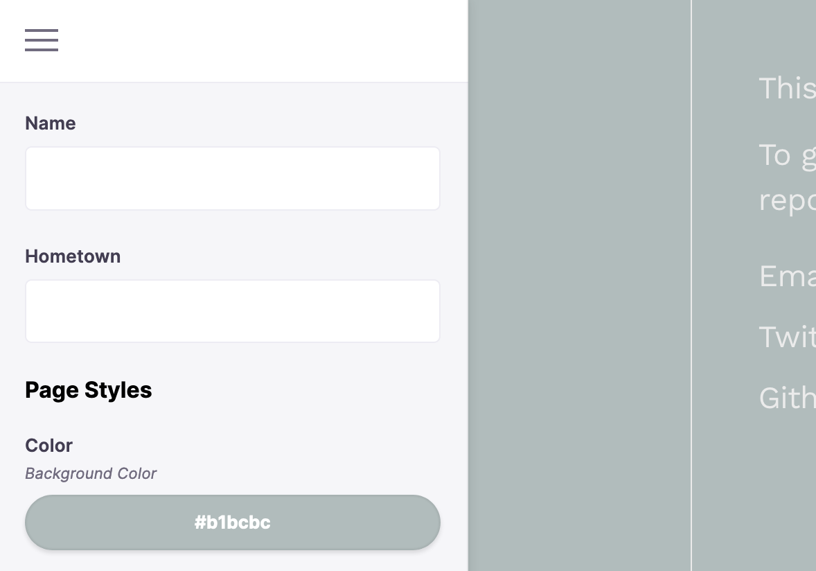
const formOptions = {label: 'About Me Page',fields: [{label: 'Name',name: 'name',component: 'text',},{label: 'Hometown',name: 'hometown',component: 'text',},{label: 'Color',name: 'background_color',description: 'Background Color',component: 'color',},],}
We could add a custom inline field component to further organize the sidebar:
const formOptions = {label: 'Info Page',fields: [{label: 'Name',name: 'name',component: 'text',},{label: 'Hometown',name: 'hometown',component: 'text',},// This is our custom inline field 👀{name: '_',component: () => <h4>Page Styles</h4>,},{label: 'Color',name: 'background_color',description: 'Background Color',component: 'color',},],}
Pretty cool huh? 🤩
Notice how in all of the other field objects, the component property is referencing a Tina field plugin, whereas with our custom inline field, we are passing in a React component.
Now this example component is super simple — a glorified label. This type of component can be helpful with organizing or customizing the sidebar, but we can go further and pass in more complex fields.
Custom Range Slider 🎨
Say we had an image on the About Me page and we wanted to be able to control some CSS filters on that image. The pen below shows all the CSS filters we have to play with.
We can create a custom input field to provide editing control over these visual filters. Let’s make a custom field that controls image saturation.
Tip: Saturation in photography relates to the intensity of particular colors in an image. A highly saturated image would be very bright, with colors bordering on neon. An image with low saturation would appear muted and grey.
1. Create the input field component
To create a custom input field, we need to make a React component that takes input and updates data when the input is altered. For this example, we are going to make a range input field that handles the state of the saturation value and updates that state whenever the range control is slid.
// An example of a custom range field componentfunction RangeInput(props) {return (<><div><label htmlFor="saturation">Image Saturation</label></div><div><inputname="saturation"id="saturation"type="range"min="0"max="10"step=".1"/*** This special input** object sets essential** input props: value,** onChange, onFocus etc.*/{...props.input}/></div></>)}
👽 Take a closer look — Props:
Notice this line, {...props.input}. You may be wondering where this magical object with all of the necessary input props is coming from?
When the custom field is registered with Tina, this input object is passed in as a prop to the field. This object contains necessary data and callbacks for the input to function properly: value, name, onChange, onFocus, onBlur.
If your custom component is not a standard HTML input element, you will need to manually pass in the necessary input props, as opposed to using the spread operator.
All of the props passed to the field component are:
field— A reference to the field definition.input— The object with data and callbacks for the field to set and update data. Outlined above ☝️.meta— This provides metadata about the state of the field.tinaForm— A reference to the form where this field is registered.
The react-final-form documentation describes the input and meta props incredibly well. When creating custom fields, you'll typically be accessing the field and input props.
Where should the custom field live?
As we saw in the first example, we can pass in the custom field component directly via the component property — component: () => <p>Hi<p>. But when we are creating more complex fields, we will most likely want to extract the field into its own function.
In the example above, RangeInput could be defined alongside the AboutMe component where the Tina form is set up:
/*** Custom field defined alongside** component using a Tina Form*/import { useLocalJsonForm, JsonFile } from "next-tinacms-json";export default function AboutMe(props) {// Tina Form configconst [data] = useLocalJsonForm(props.data, formOptions)return (//...)}function RangeInput(props) {//...}const formOptions = {/*** RangeInput will be referenced** in the custom field definition*/}AboutMe.getInitialProps = async function() {//...}
It could also be defined in its own file and imported into the file where the Tina form options are configured:
/*** Custom field definition kept in** separate file and imported*/import { useLocalJsonForm, JsonFile } from "next-tinacms-json";import RangeInput from '../components/RangeInput';export default function AboutMe(props) {// Tina Form configconst [data] = useLocalJsonForm(props.data, formOptions)return (//...)}const formOptions = {/*** RangeInput will be referenced** in the custom field definition*/}AboutMe.getInitialProps = async function() {//...}
As with many things in development, the answer depends on your use case 😉. Feel free to reference this demo repo to see a working example structure for Next.js.
2. Add the value to the source data
Now that the custom input field is defined, we need to add the image_saturation value to our source data. The source data could be a Markdown or JSON file. If you already have a Tina Form set up, it should be linked with a data source, so head to that file.
For our example, let's say we have a local JSON file called about.json. This file contains the data used in the About Me page. In it we can add the image_saturation value.
The value can be any integer or floating point number that exists between the range defined in our RangeInput component — 0 to 10, with a step of 0.1 (meaning each 'slide step' of the range increments or decrements the value by 0.1). As a saturation value, zero would be totally grayscale or no color, so we can fill in something like 3 to get a more 'normal' look.
// Example About Me Page source data --> about.json{“name”: “Koba Weasley”,“hometown”: “Bend, Oregon”,"background_color": "#B1BCBC","image_saturation": 3,}
If you’re using Gatsby, you will need to update your GraphQL query to get this new data. Add theimage_saturationfield to your query.
So now we have a source value that can be connected to the custom input field. This way, Tina can update the value in the source file in sync with the changes picked up by the RangeInput component.
3. Add the custom field to a Tina Form
How about we wire up this custom field to Tina? 🎊
In this step, we need to create the custom field definition and pass in the RangeInput component inline. We'll go back to our About Me page form options:
const formOptions = {label: 'About Me Page',fields: [{label: 'Name',name: 'name',component: 'text',},{label: 'Hometown',name: 'hometown',component: 'text',},{name: '',component: () => <h4>Page Styles</h4>,},// Pass `RangeInput` to the `component` property{label: 'Image Saturation',name: 'image_saturation',component: RangeInput,},{label: 'Color',name: 'background_color',description: 'Background Color',component: 'color',},],}
Start the development server and you should see the custom RangeInput field in the sidebar. If you slide it, you should see the value updating in about.json.
4. Dynamically set the CSS filter
If all went well, our custom input field should be wired up, but there's one last thing to do. We haven’t connected the saturation value with a CSS filter to actually see an effect on the image.
In order to do this, you’ll need to be using a CSS-in-JS framework so we can dynamically update the filter values through the component props. If you’re using Next.js, styled-jsx works out-of-the-box and is pretty fantastic. Below is an example of the saturation value being connected to the CSS filter with styled-jsx:
/*** Example component for the** About Me page in Next.js*/import { useLocalJsonForm } from 'next-tinacms-json'function AboutMe(props) {const [data] = useLocalJsonForm(props.data, formOptions)return (<Layout bgColor={data.background_color}><section><h1>Hi 👩🎤 my name is {data.name}</h1><p>Currently gallivanting around {data.hometown}</p>{/* This is the image that will get the treatment */}<imgalt="random-unsplash"src="https://picsum.photos/800/600"/></section>{/* Pass in the image_saturation value */}<style jsx>{`img {filter: saturate(${data.image_saturation});}`}</style></Layout>)}
Some other examples of awesome CSS-in-JS frameworks are styled-components and emotion.js. Note that the above implementation for these alternative frameworks this will look slightly different.
Next Steps
A good next step would be adding styles to the custom RangeInput component. You could use @tinacms/styles to fit the vibe of other Tina fields ✌️. Or you could go wild and spice up the sidebar in your own way 🤠.
If we wanted to reuse this component throughout the site, we could take a step further and make it into a Field Plugin. Stay tuned for a follow-up post that dives into creating custom Field Plugins, or swing by the docs to get a head start.
Feel free to check out a finished version of this custom range input field, or take a peak at a more complex Authors field plugin in the Tina Grande repo.
Takeaways 🕺🏻
Making custom field components for TinaCMS is incredibly exciting! Hopefully this post got your creative gears turning on the numerous variables to tinker with in the content editing experience.
I think the biggest takeaway from this short exploration of custom fields is that you can put any React component into the sidebar. This flexibility is very powerful; it opens the door for you to custom-tune the editing controls for a project depending on its unique needs. And while creating custom components may not be necessary all the time, simply knowing it’s an option is reassuring, if not inspiring.